SmartR
 Heatmap: a typical SmartR view
Workflows provided by SmartR:
General
In addition to the Advanced Workflows a more interactive mode of visualising data in tranSMART has been created. SmartR uses modern technologies to create interactive graphs directly from within tranSMART. Although the technologies are different, some of the functionalities are similar. This means a user will have multiple options for creating a desired graph. Which of the two technologies is best depends on the type (and sometimes the volume) of data to visualise.
How to run SmartR workflows
To begin to run any analysis:
In Analyze, open the study of interest.
Define the cohort(s) you want to analyze by dragging one or more concepts into empty subset definition boxes. For more information, see Defining the Cohorts.
Then, start a SmartR workflow:
Select a SmartR workflow from the main SmartR tab.
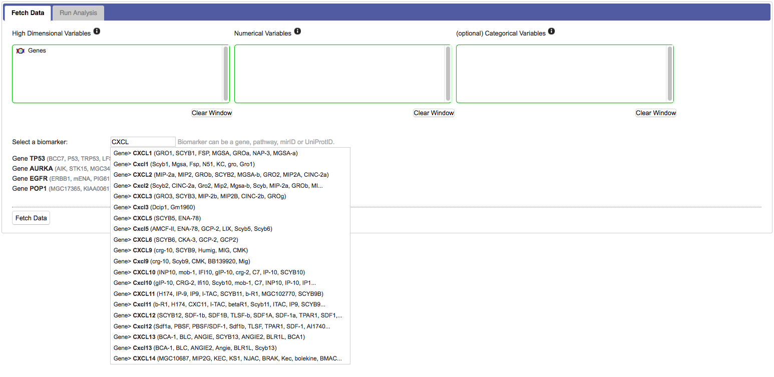
Empty selection boxes appear that allow you to drag in numerical, categorical and high dimensional nodes of interest. The boxes change colour based on whether suitable input is detected:
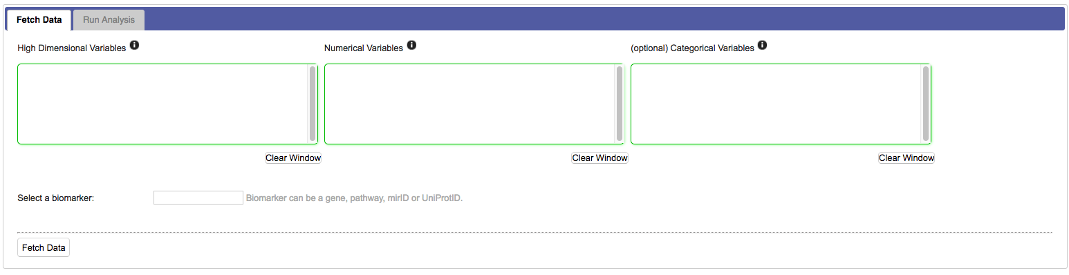
For most workflows you need to select specific markers from the high dimensional data set:
Click Fetch data. This will transport the data from tranSMART into the SmartR computational R environment. Once ready, SmartR will provide summaries of the retrieved data.
(Optional) The pre-processing tab allows you to perform modifications to your data if this is necessary. For instance, this could be recalculating z-scores based on current selection criteria, or performing probe aggregation.
Use your data in SmartR analyses by clicking Run Analysis. The page you see there is unique to the workflow you have chosen. The following sections describe how to run specific analyses after you perform the above steps.
Important
If you want to rerun a workflow after changing the source data, you always have to click Fetch data again.
General Functionality
The following functionality is available in multiple workflows:
- Capture SVG: this button allows you to download the current image to your local computer. Note: this does not always work as well as expected.
Boxplot Workflow
Data input requirements:
- Either one or two cohorts.
- One or more numerical nodes or markers from a numerical HDD node.
- Categorical nodes are optional.
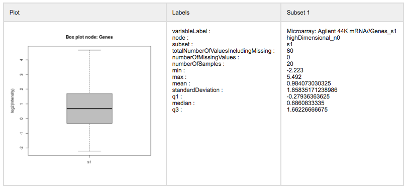
After fetching data the Boxplot workflow will draw a box and whiskers plot for every numerical node or gene selected in the previous step. Using the mouse you can zoom in to specific parts of the graphs. If you have created two subsets during cohort selection, you will see boxplots for both groups. Also visible in the workflow are:
- Controls to select data transformations: raw, log2, or log10 transformed.
- A legend that shows the colours for selected groups.
- Controls to change or reset the current view on the data or to download the current image. These controls appear on hover over.
- Also, the plot title shows the result of a calculated ANOVA test for the selected groups.
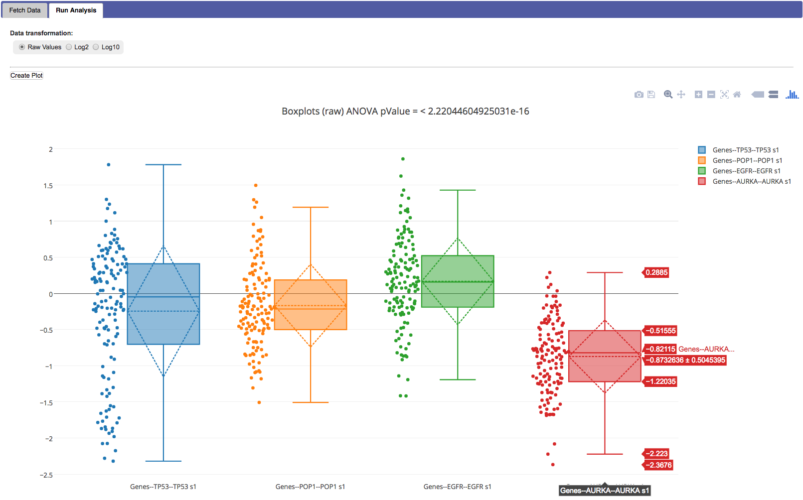
In each graph in the plot the following is shown:
- Dots with the value for each individual.
- A box that indicates the median and interquartile range, details are shown when you hover over the graph.
- Whiskers that extend up- and downward 1.5 * the IQR.
- A diamond that indicates the mean and confidence level.
Note
When zoomed in, you can reset the view by clicking the auto scaling or reset axes icon in the plot control bar.
Warning
The plots control bar has an option to Save and edit plot in cloud. Although there appear to be no issues with this powerful feature, it does upload the generated data to the external plotly service. This makes it potentially available to unauthorised individuals.
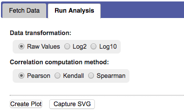
Correlation Workflow
In a correlation analysis, you are using statistical correlation to assess the relationship between variables.
Data input requirements:
- Only one cohort is supported.
- You have to add two numerical nodes.
- Categorical nodes are optional to create coloured groups.
After fetching data:
First the method for computing the correlation and a data transformation setting have to be selected.
Options are: Pearson, Kendall, or Spearman, and raw, log2, or log10 respectively.
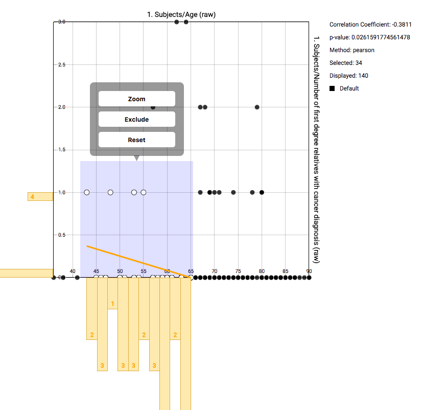
The default view after creating the plot shows a scatter plot with the two selected nodes. Every dot represents an individual, with details shown on hover over. On the axes bins are shown with counts for that specific range. A line is drawn that represents the calculated correlation and intersection. Details are shown when hovering over the line. On the right some basic statistics are shown.
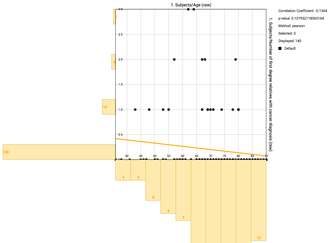
Using the mouse, you can select a subgroup of individuals to recompute the basic statistics on the right. Also the correlation will be recomputed and redrawn. The selection box you’ve created can be dragged. Right clicking it gives the option to zoom in on that area, to remove those individuals from the computed statistics, or to reset the entire selection.
Note
You display values as coloured dots instead of black by including categorical values in the Fetch data step.
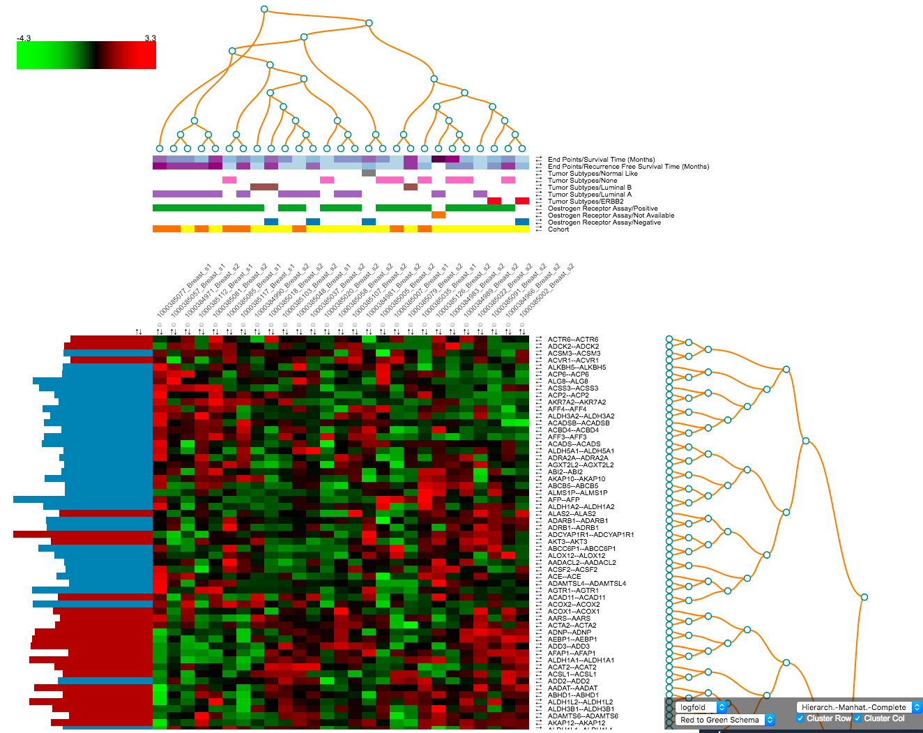
Heatmap Workflow
A heatmap is a matrix of data points for a particular set of biomarkers, such as genes, at a particular point in time and/or for a particular tissue sample in the study, as measured for each subject in the study.
Data input requirements:
- Either one or two cohorts.
- At least one numerical HDD node with one or more biomarkers selected.
- Low dimensional numerical and categorical nodes are optional.
After fetching data the following control panel will be shown:
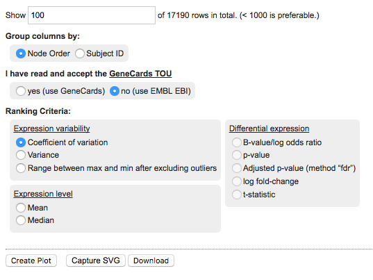
The panel provides the following options:
- Rows to show: change this number to control the number of rows to show in the final heatmap. The rows shown depend on the chosen Ranking Criteria.
- Group columns by: you can set this to either Node Order or Subject ID.
- GeneCards: Set this to Yes to confirm you have read the terms of use for the GeneCards service. Using this option will create references to the GeneCards webservice for details about specific markers. If this is left to No, then clicking on biomarkers in the corresponding heatmap rows will open the relevant page at the EMBL EBI web service.
- Ranking criteria: choose the metric to apply biomarker ranking. This will determine the order of rows in the heatmap. Options include metrics based on Expression level, Expression variability, and Differential expression. The last option is only available when having defined two cohort subsets during cohort selection, see Heatmap: Differential expression.
The heatmap will appear after clicking Create plot.
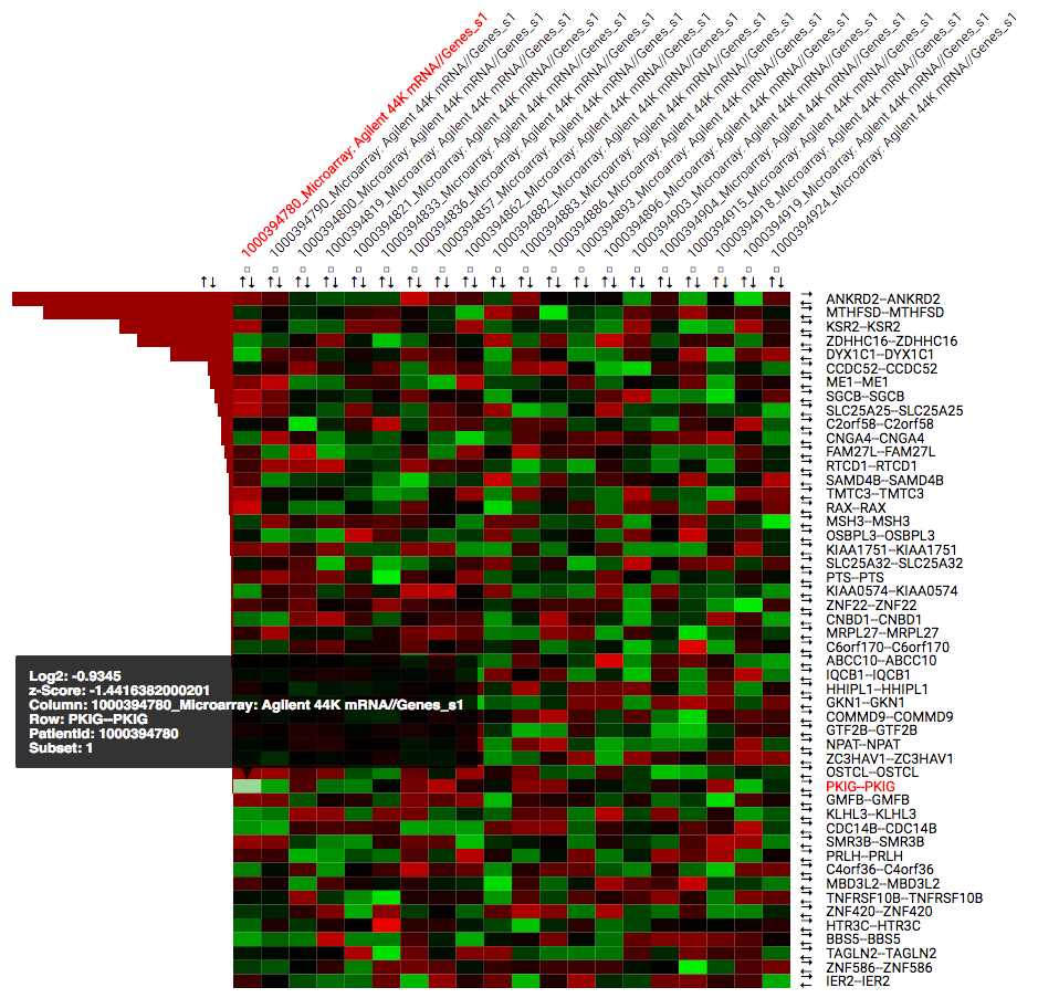
By default the heatmap is sorted based on the chosen ranking criteria. The heatmap contains the following elements:
- Rows for each of the selected (or all) biomarkers for the selected data node. Clicking on gene identifiers takes you to external reference pages (GeneCards or EMBL EBI).
- Numerical or categorical nodes added will be shown on separate rows.
- Columns for each individual in the chosen dataset, with the identifiers as they are known in the tranSMART.
- Coloured squares based on the calculated z-score. The colour scheme can be changed in the Heatmap: Toolbar. Hovering your mouse over the squares provides additional information. By default green means a low z-score where red means a high z-score. This can be adjusted in the toolbar.
- Each row and column has a set of arrows that can be used to control the ordering of the heatmap. Small checkboxes allow users to highlight specific columns in the heatmap.
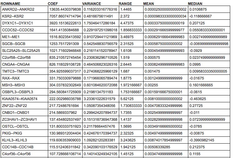
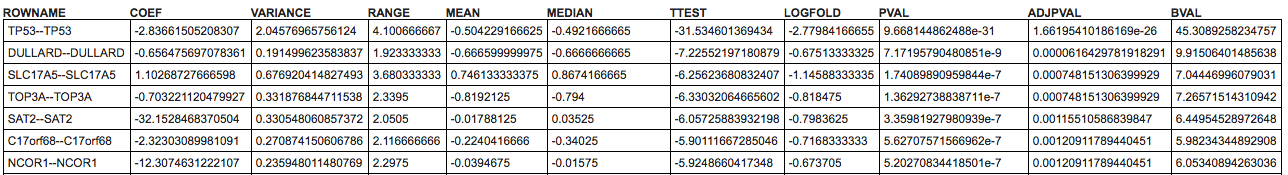
Below the heatmap itself you can find a table with detailed results for all computed statistics that are available in the Ranking Criteria section of the control panel.
Note
Next to the Create Plot, Capture SVG button a Download button is available that downloads the input data data and the computed statistics.
Heatmap: Toolbar
The toolbar in the bottom right of the window provides a set of functionalities to change the current representation of the heatmap.

Marker statistic: a dropdown (default: coef) that allows choosing several statistics that can be used to display in the most left column of the heatmap. Available options: coef, variance, range, mean, and median.
Colour scheme: set the heatmap colours different multiple or single colour schemas, default is Red to Green Schema.
Zoom: make everything smaller or bigger.
Apply cutoff: remove rows from the heatmap based on a cut-off on the chosen ranking criteria. There is also a reset button.
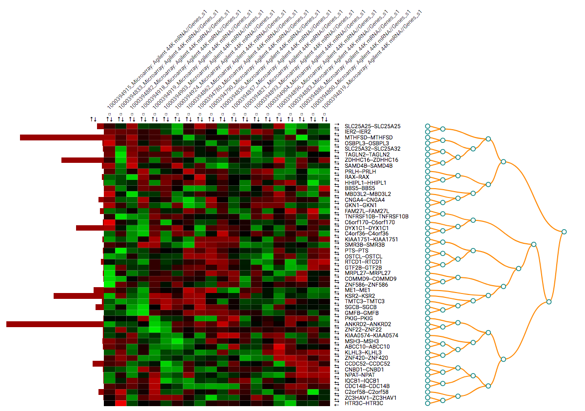
Clustering: the toolbar allows the user to create clustering instead of normal ordering, using the R functions for
dist()for calculating distances andhclust()(docs) for clustering. Computed are Euclidean and Manhattan distances with complete, average, and single clustering.Based on the chosen clustering the order of columns and rows will change to reflect the computed clusters. Dendrograms are shown to display the results.
Clustering can be done for columns, rows or both.
Heatmap: Differential expression
When having defined two cohort subsets some of the aspects of the analysis will be different. For one, the summary page that is shown after Fetch data will show information for both subsets. The heatmap control panel will have the options for Differential expression enabled under Ranking criteria. This allows the users to order the rows based on one of multiple differential expression metrics.
The heatmap image itself will have an additional row to indicate to which subset an individual belongs. This bar allows researchers to easily identify the groups after performing ordering or clustering.
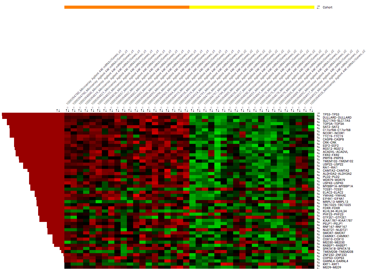
The table below the heatmap will show additional columns the additional options available in the Ranking Criteria section of the control panel (TTEST, LOGFOLD, PVAL, ADJPVAL, and BVAL). These measures that have been calculated between both subsets.
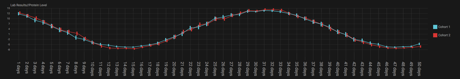
Linegraph Workflow
Data input requirements:
- Both one and two selected cohorts supported.
- Multiple numerical nodes.
- Categorical nodes are optional.
To create a graph, drag multiple numerical nodes from the same folder, containing a measurement performed at multiple time points, in the Fetch data step. The graph shows the average and error for both subsets at every time point. Adding categorical nodes provides boxed information per individual.
In the bottom of the screen a control bar is shown that contains:
- Drop down to set the type of statistics to display: mean vs median and SEM vs SD
- Tick boxes to evenly space timepoints, Smooth graph, and User weighted events
Important
For the line graph to model your data correctly, the nodes in the concept tree have to be arranged in a specific way. All nodes that belong to a single subfolder in the concept tree will be displayed in a single graph. If nodes originate from different subfolders, then multiple graphs will be shown. Like so:
Volcanoplot Workflow
Data input requirements:
- Only two selected cohorts is supported.
- A high dimensional numerical node.
The Volcanoplot allows you to use a high dimensional expression data set (not aCGH or VCF) to create the following plot:
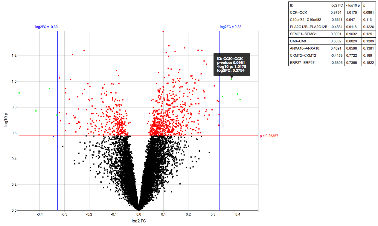
Each dot represents a marker from the selected high dimensional data node. Its position on the x-axis is the log2 fold change between the selected groups. Its position on the y-axis is the -log10 p-value as calculated to determine whether two groups have differential expression for this marker (calculated using the Limma R package).
The blue (logFC) and red (p-value) lines are draggable and allow you to control the number of markers shown in the table on the right or below (depends on screen size). Hovering over dots shows its details.
Important
Because the Volcanoplot draws a very large number of elements on screen, not all web browsers will work seamlessly. Users might experience better performance with Google Chrome than Firefox for instance.
Undocumented workflows
Currently the Patientmapper and Ipaconnector workflows are not documented here.